Operator's Manual

How to actually trade what TradeMath shows you

← Back to the desk
Nothing matches that — try a shorter word, or a term from the site itself (alpha, spread, regime, extended…).

Cumulative Relative Performance

The line that ignores the market's mood.

What it is

Take the stock's move each day. Subtract what it should have moved, given its beta and what the market did. Add up the leftovers, day after day. That running total is the line.

You get it twice: once against the market (SPY), once against the stock's own sector.

The mental shift

Rising line ≠ rising price. Rising line = beating expectations.

NVDA +1% on a day SPY is +2% → green candle, falling line.
The market carried it. The stock added nothing of its own.

This is the whole trick: strip out the market's motion, and what's left is the stock's own story.

The chart, element by element

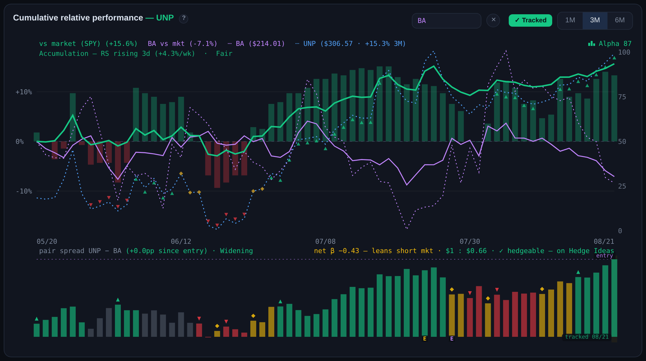
Green line — vs market. Yellow line — vs sector. Dotted blue — the price itself, for context.

Alpha bars (right axis, 0–100) — the engine's graded verdict on all of it. 50 = no edge. The Alpha chip top-right colors itself: green above neutral, red below.

Status line (top-left) — the current phase in plain words: Accumulation or Distribution, how long the relative move has run and at what pace, plus the extension read (Fair, Extended Support, Very Extended…).

E under a bar — an earnings day. Expect the line to bend there; judge the slope after the gap, not through it.

The last bar tells the time. During the session it's live and moving. After the close, the solid bar is where the session settled; a faint bar with a blue stamp shows where extended-hours trading has taken it since. Pre-market, the blue stamp alone marks the early tape before today's bar exists.

Hover anywhere — every legend number re-reads for that date. Scrub back through a move to replay it.

The signal ribbons

▲ green run (under price) — confirmed relative strength: the score is strong and still building. Historically these stretches preceded further outperformance.

▼ red run (above price) — confirmed weakness: score low, relative performance still bleeding. Read it as avoid / underweight — in quality names weakness tends to mean-revert, so it's a warning, not a buy-and-hold short. When a flagged name is already deeply discounted, the ticket relabels it bounce risk — the snap-back is statistically the bigger danger there.

◆ yellow — the handoff: one regime has ended, the next isn't confirmed. Expect chop; size accordingly.

Runs, not one-offs. A signal must persist before it prints, and it keeps printing while conditions hold. No marks at all = no edge either way — that's information too.

Compare mode

Type any covered ticker into + compare — its own vs-market line drops in (solid purple), same beta-adjusted frame, plus its raw price as dotted purple (dotted always means price; the color says whose). To keep the frame readable, the vs-sector line steps aside while you compare — it returns the moment you clear the box. NVDA vs AMD, head-to-head, with the market's motion removed from both.

A histogram appears underneath: the pair spread — your stock minus the compare, in percentage points. That's the subject of the next entry.

The lane also grades the pairing. net β is the pair's leftover market exposure per $1 long at the shown sizing: each leg has a market beta (how much it moves when the market moves, weighted toward recent months), and the short leg's, scaled by the sizing, subtracts from the long's. Near zero (green) the pair is a pure relative bet — the tape cancels out. Away from zero (amber, then red) the "hedge" still quietly leans long or short the whole market, and a broad move drags your P&L regardless of who's winning the spread. The sizing ($1 : $0.82) equalizes daily movement, not market exposure — which is exactly why net β is worth a glance: an equal-risk pair can still carry a market lean. The number is directly usable: nβ × your long-side dollars ≈ the hidden market position you're carrying. At nβ −0.29 with $2,600 on the long side, you're effectively short about $750 of SPY on the side — a +1% market day costs ≈ $7.50, a −2% day pays ≈ $15, whoever's winning the spread. From there it's a choice, not a flaw. If the lean points the way you already think the tape is going, it's a small market opinion riding free on top of the spread — leave it on. If you want the spread pure, cancel it directly: add that many dollars of SPY in the offsetting direction (buy SPY when nβ is negative, short it when positive) and the lean nets to roughly zero while the spread sizing stays untouched. The third leg is optional either way — small leans are usually cheaper to accept than to trade away. Then the verdict: ✓ hedgeable — the names move together enough to trade as one spread (tight marks the closest). ✗ weak pair — not enough shared movement; you'd just hold two separate bets.

A red nβ is a quality caution, not a hedging to-do. In our replays, pairs entered with a large lean were the strongest cohort over the first two weeks — and the weakest by a month, with the heaviest tails of any group. A big lean usually means one leg's beta has collapsed or exploded: the pair is structurally lopsided, and its payoff is front-loaded. Cancelling the lean with a third leg didn't fix that (the lean is a tiny share of a pair's risk — removing it barely moved the book), so the tested read is simpler: on a red chip, prefer the front of the payoff window and let the Narrowing rule take you out early rather than late. Example: a red-chip pair that hasn't paid by day 10 has history leaning against it.

How to trade it

Buy strength that's building — the line rising, and still rising. Relative leadership persists: accumulation takes weeks, not hours.

Reduce when it rolls over. Don't wait for the price chart to agree — relative weakness is the early warning, not the aftermath.

Both lines rising — vs market and vs sector — is clean leadership. Rising vs sector only? That's a sector story wearing the stock's clothes.

Watch out

Earnings gaps bend the line in one day. Let a couple of sessions pass — trade the new slope, not the jolt.
Thin markets lie. A leader in a market where breadth is going out (red Tide) is a lonelier bet than the same chart with the tide coming in.
The lines are the raw material. Alpha is the engine's graded verdict on them — multiple horizons, volatility-adjusted. Read them together: lines for the story, Alpha for the signal.

Alpha & the Score Strip

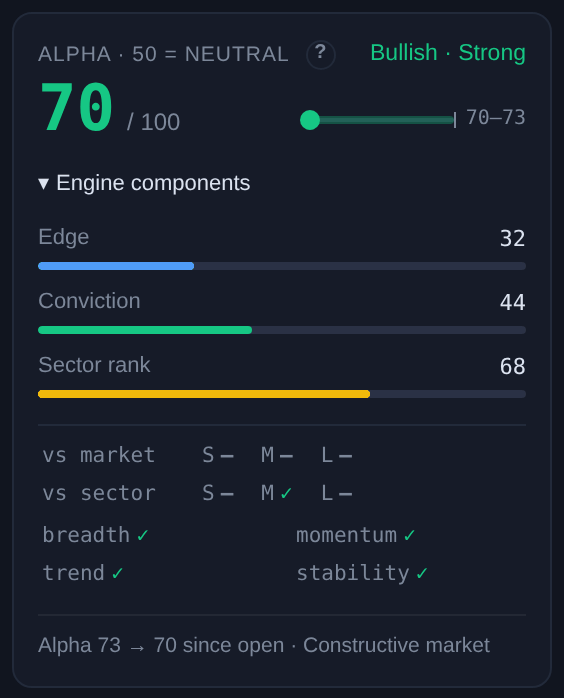
One number for "how much edge, which way, and how much to trust it."

The scale

0–100, and 50 means nothing to see. Above 50 = relative leadership building; below = relative weakness. 80 is strong multi-horizon leadership; 20 is its mirror on the short side.

Direction · Strength next to the number (Bullish · Strong) is the same information in words. A name too weak to lean either way reads Neutral — no forced opinions.

What's inside it

Relative strength vs the market and vs the sector, over multiple lookbacks. Confirmation from peers. Trend health. Not every ingredient counts equally — the blend is ours.

Then the discounts: unusual volatility for that name pulls the score toward 50, a fresh shock is flagged before it's allowed to move the score, and a market mood that opposes the name trims the edge. Alpha is post-discount — the caution is already in the number.

Engine components — the three dials

Edge — how far this name's relative-strength picture sits from neutral. The raw material.

Conviction — how much the engine trusts the read after volatility and noise adjustments. High Edge + low Conviction = interesting but treacherous. The heatmap's Confidence view shows the raw material behind it: how many of the engine's independent checks currently agree with the call — relative strength across several horizons against both the market and the sector, peer breadth, trend and momentum. "9/10 signals" is a chorus; "3/10" is one loud voice and a lot of shrugs. The count is always out of ten, and the tenth check is stability — the name's short-term behavior. Steady (no abnormal one-to-two-day moves) counts as agreement: nothing violent is contradicting the read. A sustained shock makes stability vote directionally — with the call if the surge runs the read's way, against it if not (the ⚡ badge is reserved for that counter-trend case, because it's a warning). A fresh shock — sharp but not yet persistent — abstains until it proves itself, so a single wild day can't swing the count. And the chorus has been worth listening to — in our testing, bullish reads with near-unanimous agreement went on to beat the market by a meaningfully wider margin than split reads over the following weeks. A tested expectation with the usual caveats, and one that held for bullish reads: on the short side the evidence is mixed so far, so treat bearish agreement as description, not endorsement.

Sector rank — how much of the name's own sector it is currently beating, oriented to the side of the call (for a short, how much of the sector is beating it). High always means the evidence agrees with the direction.

It's a rank, not a health check: 97 in a hot sector is a monster; 97 in a struggling one is the best house on a rough street. The health check sits two cards over — Sector tone. Rank 97 + tone 19% isn't a contradiction; it's the full picture: leader of a weak group.

Sector rank 97 · Sector tone 70% → broad advance, leader among leaders.
Sector rank 97 · Sector tone 19% → concentrated leadership — prime hedge-pair long leg, but crowded and lonely if it cracks.

The footnote, decoded

Alpha 80 → 88 since open · Risk-Off market · headwind for longs

First part: what the score has done today. Second: the market's mood (Risk-On → Constructive → Mixed → Cautious → Risk-Off) and — when it appears — headwind/tailwind is disclosure, not advice: the engine has already trimmed (or credited) this name's edge for the tape. Don't discount it a second time yourself.

The score strip, card by card

Selected Alpha — the focused name's score, direction, and where it opened. Identical to the big number in the detail panel, kept in view while you browse.

The price line follows broker convention: the day change is measured against the prior session's official close. After 16:00 ET the headline number freezes at the closing print, and any evening movement shows separately as a small AH figure against today's close — so a quiet after-hours drift never rewrites the day you actually traded.

Relative value state — the Extension read (Fair, Very Extended, Deep Discount…) vs the name's own sector norms. Position, not direction.

Tone — how bullish a scope is leaning: the share of names the engine calls Bullish. 50% is balanced; the descriptor says it in words (65% = Bullish, 19% = Bearish). With a stock selected the card shows its sector's tone — the denominator for that name's Breadth — against the market and universe tones below. At sector or market level it reads Market tone vs universe. Your opportunity-set gauge: 60% is a stock-picker's tape, 25% means longs are fighting the current.

Market regime — the tape's own health, read from our TM Breadth set: how many names are in uptrends, and whether fresh highs outnumber fresh lows. Same regime that feeds every name's headwind/tailwind.

Tone vs Regime — they can disagree, and that's the point. Tone is relative: where is the leadership, who's beating the market. Regime is absolute: is the tide rising or falling. Lean-bullish tone + Cautious regime = relative winners exist, but the tide isn't helping — be selective, size down. Both bullish = green light; both bearish = stand aside.

The Signal Heatmap — three views

The heatmap is the three engine dials spread across the whole universe, one view per dial. Alpha — the score itself: where each name stands on the 0–100 scale. Confidence — how much to trust each read: the tile counts how many of the engine's ten checks agree with the call (10/10 signals is a chorus), and mentions volatility or a tape headwind only when one is actively working against the name — silence means nothing's wrong. Sector rank — where each name stands inside its own sector's race, as a percentile, oriented to the call.

Same tiles, three questions: how strong · how sure · how special within its group. A name that lights up on all three is the full package; strong on Alpha but weak on Confidence is a read to size down; strong on Sector rank in a weak sector is hedge-pair material.

The Market tab — a rotation map, not a scoreboard

At market level the sector cards answer two questions at once: where does the sector stand against the market, and which way is it moving? The two together give four states. Leading — strong and still gaining: leadership in force. Weakening — still strong, but momentum is cooling: the early rotation warning. Improving — behind the market but gaining: where next quarter's leaders come from. Lagging — weak and still losing: the short-hunting ground. Cards sort in that order, so the top row is what's working now and the bottom row is what's bleeding.

Two small tags add the inside view. split — the sector has real leaders and real laggards at the same time: it's fighting itself, which is exactly where hedge pairs live. quiet — almost nobody stands out either way: the sector is asleep, and pair edges there are thin. A sector can be Lagging yet split — weak overall while a few members buck the trend — and that combination says more than either word alone.

Don't be surprised by an all-green-and-red map. In a steadily trending tape, position and direction agree almost everywhere — leaders keep gaining, laggards keep bleeding — and the mixed states barely appear. That's normal. Weakening and Improving are turn signals: when rotation starts, Weakening shows up at the top before the leader actually breaks, and Improving at the bottom before the laggard's score recovers. The lead time is the point of the second axis — when amber and blue cards start appearing, the ranking is about to reshuffle.

True peers

Under every stock's ticket sits a row of peer chips — the names this stock actually moves with, measured from day-to-day co-movement after the market's influence is stripped out. That's what makes them "true". A category list calls everything in Technology a peer of everything else in Technology. Measurement disagrees: a cybersecurity name travels with other cybersecurity names, not with chipmakers. And real peers can sit in different sectors — airlines, cruise lines and booking sites often move as one travel trade. Cross-sector peers are marked .

The green depth is the strength: a solid chip is an exceptionally tight co-mover, a mid green is tight, a faint tint is moderate. Some names show none at all — that's information too: they trade to their own beat. Click any chip to overlay that peer on the chart, where the pair spread and hedge check take over. Relationships are re-measured every trading day.

Drivers — sectors and the index

Open a sector and the same box becomes Drivers: the members whose day-to-day movements actually explain the fund's, with an approximate share next to each. This is measured, not copied from a holdings sheet — we work it out from how the fund and its members move together, and it answers a slightly different question than the fund company's published weights. A name earns its share here by contributing identifiable movement: a distinctive mover gets full credit, while near-twins that always move together end up sharing it, and the shares are expressed over the names we cover. So the percentages won't match the issuer's sheet exactly — the top of the list will, and the disagreements are usually the interesting part: they tell you who really swings the fund day to day.

On SPY the box reads Moves with the index — the names whose daily moves track the index most closely across the whole universe. Useful in both directions: they're the tape's bellwethers, and when one of them starts pulling away from the index, that divergence is information about the name (in our testing, a coupled name breaking upward kept going — and a coupled name lagging a rising tape was a warning, not a bargain). Click any chip to overlay it, as everywhere.

How to trade it

Direction of Alpha beats level. Rising through 60 is a better entry than sitting at 80 — the move is being built, not already spent. And the same rising score is worth more from Fair or Discount than from Extended: strength that hasn't stretched yet has somewhere to go.

Level sets size. High Alpha with high Conviction earns a full position; high Alpha with Turbulent volatility badges earns a smaller one. Agreement sharpens this on the long side: in our testing, bullish reads where nearly all checks agreed went on to beat the market by a meaningfully wider margin than split reads — so a split-signal long deserves a smaller position, or patience until more checks line up. On the short side that pattern has not held so far, so size shorts by risk, never by our certainty.

Bleeding back toward 50 is the early exit — the score decays before the price chart confesses. Pair it with the chart's ribbon for the visual confirmation.

Watch out

Alpha is a multi-week read, not a day-trade trigger. Intraday wiggles of a point or two are noise; the open→now move matters more than the last tick.
Alpha at 80 doesn't mean an 80% chance of anything. It's a rank of relative-strength quality, not a probability.

Reading the Context Panel

Five lines, one story: velocity, position, and what to do about it.

Line by line

Signal — the chart ribbon's current state. ▲ Strength run = engine-confirmed leadership, still active. ▲ cooling = the run's gone quiet — paused, not reversed. ▼ Weakness = confirmed underperformance; read as avoid — unless the name is already deeply discounted, where the same mark reads as bounce risk (washed-out names snap back more often than they keep falling). No signal is information too: no edge either way.

Phasevelocity. Which way relative strength is moving right now, how long it's run, at what weekly pace. Accumulation = money flowing in; Distribution = money leaving.

Extensionposition. How far the name is stretched above or below its normal range vs the market. Very Extended, Fair, Deep Discount… a level, never a direction.

Movement — the name's character. The bar's length is how much it moves day to day (0–100, from recent volatility — the row translates it into a typical daily swing, so 60 reads as roughly ±2.7% a day; the market itself sits near 20); the blue share inside is how much of that movement the broad market explains, the amber remainder is the stock's own story. Two names with the same score can be opposites: a mostly-amber mover carries stock-specific risk and reward, a mostly-blue one largely rides the tape. That contrast is hedging fuel — pair a storyteller with something market-shaped and the market leg cancels, leaving the story. One trap to avoid: this measures day-to-day co-movement, not chart shape. Two charts that both climb for months can still be strangers day to day — shared drift isn't shared wiggles, and daily wiggles are what a hedge actually cancels.

Earnings — the next confirmed report date, and E marks on the chart for past ones. Signals through an earnings gap are suspect for a couple of sessions — the panel keeps the date in front of you so you're never surprised.

Benchmark — what everything is measured against. A tech stock is judged vs Technology (XLK); a sector vs the market.

✦ Read — the panel combining Phase × Extension into one plain-language verdict. Every verdict it can produce is decoded in The combinations below.

Why Phase and Extension aren't contradictory

A car doing 80 mph (Phase) can be in the middle of the road or at the cliff edge (Extension). Speed and position are different facts — the trade lives in the combination.

Phase: Accumulation — RS rising 2d (+8%/wk)
Extension: Very Extended
→ ✦ Late-stage strength — still being bought, but the rubber band is taut.

The combinations

Accumulation + Fairhealthy advance. Strength with room to run: the cleanest long setup.

Accumulation + Discountearly recovery. Being bought off washed-out levels; often the best risk/reward, least obvious on a price chart.

Accumulation + Extendedlate-stage strength. Momentum favors holders; fresh entries are chasing. Hold with a trailing plan, don't initiate.

Distribution + Extendedtopping risk. Stretched and being sold — the trim/exit combination.

Distribution + Discountcapitulation zone. Weak and washed out. Late to short; watch for the base instead.

Flat + Extendedstalled at the highs. No push, no break. Whoever moves first wins.

Watch out

Extension can stay extreme for weeks in a strong trend — it's a risk dial, not a timer. Don't fade "Very Extended" on its own; wait for Phase to turn.
The Signal chip and these lines are computed from the same data as the chart — if they ever seem to disagree with what you see, hover the chart and scrub: the ribbon's last few days usually explain it.

Hedge Pairs & the Spread Lane

Two tickers. No market.

What it is

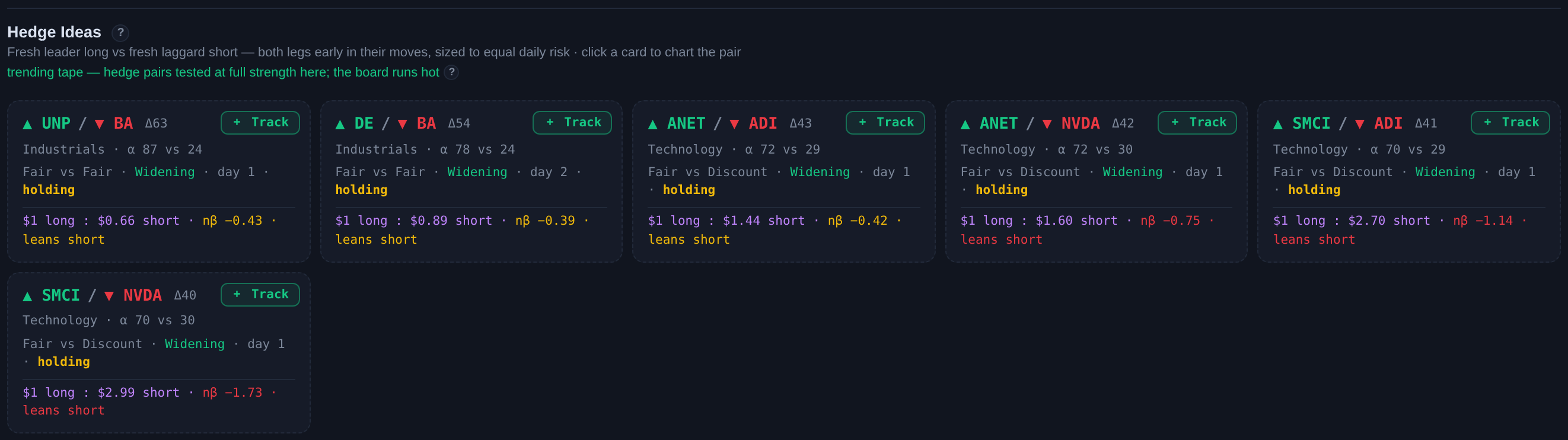
The Hedge Ideas cards scan every sector for a strong leader and a weak laggard scored far apart — and require both legs to be early in their moves. A leader that's already stretched, or a laggard that's already washed out, disqualifies the pair no matter how wide the gap. Δ is the score gap — bigger gap, stronger idea.

Each card shows the sector, both legs' Alpha scores, each leg's extension state (the freshness that earned it the slot), and the equal-risk sizing. Click a card and the whole thesis loads: leader on the chart, laggard in compare, spread lane underneath.

Fewer cards on some days is deliberate. Late in a stretched rally most leadership is already extended, so little qualifies — the count itself tells you how much fresh opportunity the tape is offering.

Why pairs

Long the leader, short the laggard — the market's moves hit both legs and cancel out. What's left is the gap between two businesses. Crash or melt-up, you're only exposed to the spread.

In testing, wider score gaps have preceded larger forward spreads — and unlike single-name signals, the edge persisted over multi-week horizons, because market drift is out of the equation.

Why freshness matters: a stretched leader has already spent most of its move — what remains is mostly snap-back risk. A washed-out laggard is primed to squeeze. In testing, pairs with both legs early in their moves carried by far the strongest forward spread, while pairs built from two exhausted moves showed none. The cards only offer the former.

Reading the spread lane

Bars = the spread's journey — the leader's relative line minus the laggard's — measured from the chart's six-month start, at every zoom: a day's value never changes when you switch 1M/3M/6M, only which days you see. The axis fits the visible range, and the zero line appears only when the window actually crosses it — no half-empty lane, no level pretending to matter while it's off-screen. Posture keeps the sign readable even then: a window entirely above its anchor stands its bars on the floor; one entirely underwater hangs them from the ceiling. Color carries the trend — grey when the spread is quiet, green through a Widening run, red through a Narrowing run, amber on transition moments: brief undecided handoffs between opposite runs (longer pauses stay grey — that's real quiet, not a handoff), and the third straight Narrowing day, where the tested exit fires (the label spells it out: Narrowing 3d — tested exit). Each colored stretch opens with its matching marker — Widening, Narrowing, transition — so the read survives without the color, and single-day flickers stay grey: a run needs two consecutive days to earn its color, with one-day gaps bridged, the same debounce the chart's ribbons use.

The number in parentheses is the current spread — it re-reads as you hover, so you can measure any stretch of the trade.

When comparing, both legs' earnings sit at the lane's floor — an amber E for the focus leg, a purple E for the compare leg — because the pair owns its whole calendar risk. While a Narrowing run is alive, the label counts it day by day. Track the pair and the lane gains two references. A dotted line at your entry level — bars above it mean the trade is paying — with the readout switching to percentage points since entry. And your holding itself as a green band: gentle from your entry day, stepping a shade brighter through the tested payoff window, whose edges wear chevrons — > opens it at day 10, < closes it at day 21, each appearing once its day reaches the chart. While you're inside the window the lane header counts it — tested window — day 14 of 21. Outsized one-day breaks against the spread's trend don't mark the chart — they flag in your tracker, where there's room to explain them.

The spread's own trend — the lane also reads Widening (the spread is still opening), Flattening (momentum gone), or Narrowing (closing against the position), judged from its recent path against its own noise — no anchor, no window dependence. In our testing, pairs entered while the spread was still widening went on to clearly outperform those already flattening, and pairs entered against a narrowing spread lost on average. A tested expectation, not a schedule — any single pair can break the pattern. The same word appears on each Hedge Ideas card.

On the right of the lane: the hedge readout — the pair's net β (leftover market exposure at the shown sizing, colored green near zero), the dollar sizing, and the verdict. The same nβ chip rides the board cards, the ticket shows it as a Market lean scale — a dot between short-bias and long-bias with the verdict in words — and it freezes into the tracker at entry, so you can always see what market lean you actually put on. The tracker keeps watching after that: betas drift, and if a pair's net exposure at your frozen sizing has moved well away from what you entered with — and now carries a real lean — the row raises a hedge drift flag with both numbers. Drift toward neutral never warns; that's the market doing you a favor. Any pair served on the Hedge ideas strip reads ✓ hedgeable — on Hedge Ideas with the strip's own sizing, so the chart and the board always agree. Ad-hoc pairs you build yourself get graded on the spot.

pair spread AAPL − ORCL (+56.6pp) → long AAPL / short ORCL earned 56.6 points of market-neutral spread since the chart's six-month start (or since your entry, when tracked).

How to trade it

Enter when the gap is wide and the spread lane is still trending up — you want the divergence and its momentum.

Exit or trim when the lane flattens or the laggard's score starts recovering — gap closure is the trade ending, not a dip to add into.

Give it two weeks. In our testing, the first days of a new pair did little — the spread's gains concentrated in weeks two and three, and by about a month the typical spread had stopped growing and began to give back. Treat that as a tested expectation, not a schedule: individual pairs pay early, late, or not at all. The spread lane, not the calendar, has the final word — a spread still widening is a trade still working, whatever day it is.

The exit that tested best: three straight Narrowing days, or about four weeks — whichever comes first. One reframe worth internalizing: this rule fires on winners too, and that's its best case — the tracker says so in words (exit with the win when you're ahead, plain tested exit when you're not). Red means "act," never automatically "bad." We made the exits compete on the same replayed trades. Cutting a pair after three consecutive Narrowing days kept the same overall return as holding a flat three weeks, in roughly a quarter less time, with a meaningfully smaller worst case. It works by asymmetry — many small early exits from pairs that die, while the ones still widening run their course. Three other results are worth as much as the rule itself: exiting the moment a pair drops off the Hedge Ideas board was far too early (conditions flicker daily — treat that as a review prompt, not an exit); price stop-losses tested worse than no rule at all, because a spread breathes with noise and a stop just locks the breathing in; and holding past four weeks gave most of the gains back. As always: a tested expectation across many trades, not a promise about any one.

Sizing — one rule everywhere: 1:0.82 = $1 long for every $0.82 short, scaled so both legs swing the same dollars on a typical day. The quieter stock takes the bigger side; the P&L then tracks the spread, not whichever leg is more volatile. Equal dollars is the acceptable lazy version.

Tracking a pair or expression

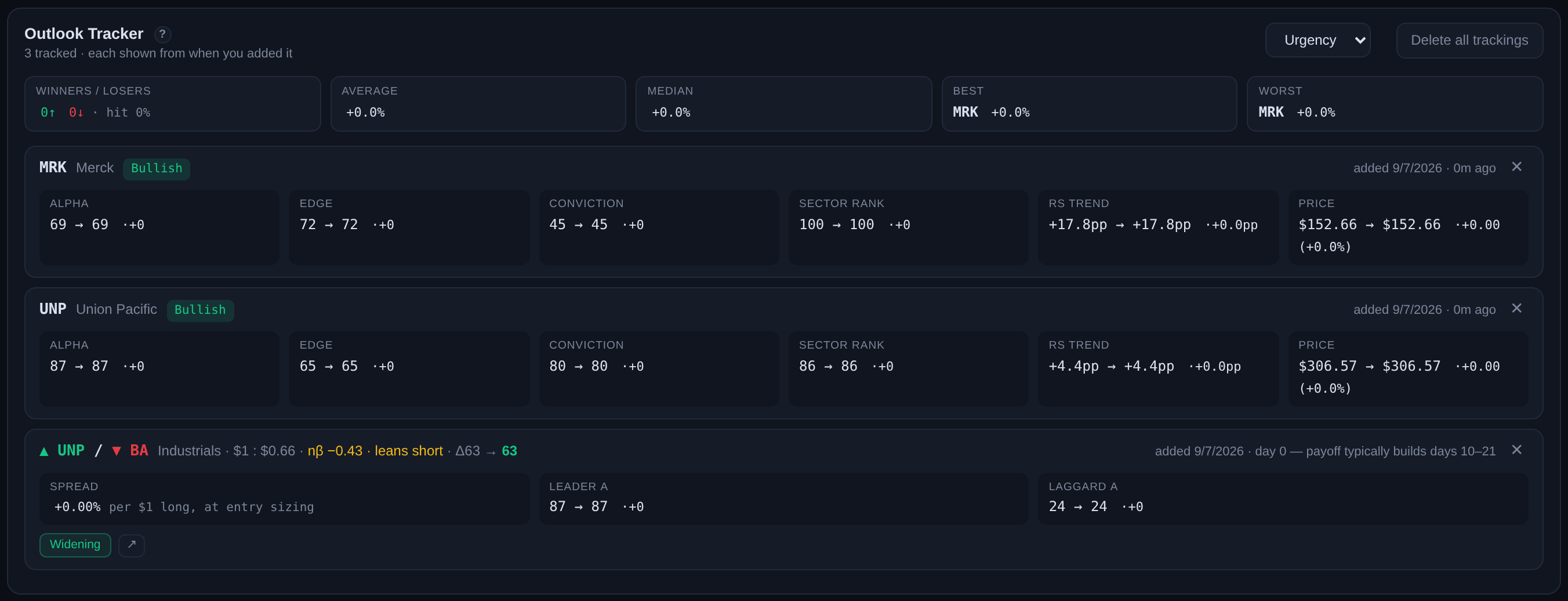
Hit the green + Track button on any Hedge Ideas card, on the Hedge idea row of a symbol ticket, or on the compare chart (+ Track pair — including pairs you assemble yourself), or Track expression on a Relative ticket, and the trade is frozen exactly as it stood — legs, sizing, entry day. The chart remembers too: a dashed tracked marker appears on the CRP graph at your entry day for tracked names, and the spread lane wraps a tracked pair's holding in a green band from entry, brighter through the tested days 10–21 (bracketed ><) — all of it staying only as long as the tracking does. Click the marker to jump straight to that trade in the tracker below — and it works both ways: tracker tickers are links back up to the chart, with pairs loading both legs and the spread lane. Track the same name more than once and the chart marks only your latest entry (a +1 notes the earlier ones), the tracker groups them together newest-first, and the ticket lists each tracked date as its own link. (Expressions don't mark the chart — their hedge legs aren't drawn on it.) That freezing is the point: the live cards keep evolving as conditions change, but your trade doesn't, so the tracker measures what you'd actually be holding, not today's reshuffled idea.

Each tracked row then reads its own health against the tested findings: the spread since entry at your frozen sizing, which day of the measured 10–21 payoff window you're in, the current Widening / Flattening / Narrowing state — with a tested exit flag when a three-day Narrowing run appears — and the Alpha gap then and now (Δ59 → 50), colored by one question only: is the thesis still ahead of you? When the gap is mostly spent, a chip says so in words and names your quadrant — gap converged — unpaid (edge gone for nothing), gap converged — paid (story ended your way; what remains is luck), or gap inverted when the ranking has outright flipped. Chips obey a strict hierarchy — one verdict speaks (tested exit, spread shock, or a gap verdict) and the plain trend chip yields — so a green chip never argues with an amber one on the same row — and an amber review note when the entry conditions have changed (leader faded, laggard recovering — for pairs you assembled yourself, the review instead measures how far each leg has drifted from where you entered it). An earnings flag appears when either leg reports inside the window — the one calendar risk a spread can't diversify away — and when a report lands today or tomorrow, the whole tracker row turns amber with the legs and dates named: the one deadline a position can't wait out. A spread shock flag fires when the spread breaks hard against its own trend in a single outsized day: in testing, moves that size behaved like news rather than noise — smaller counter-trend jerks faded and the trend resumed, but past a point the trend can no longer be presumed alive. Review promptly; the three-day Narrowing run remains the tested exit. Review means look; the Narrowing run makes the call. Directional outlooks carry the same idea: a thesis weakened or thesis flipped flag when today's read no longer supports the call you snapshotted. ◆ on a card or a hedge leg marks true peers — legs that genuinely co-move once the market is removed.

Two colors, two directions of time. The Δ's color looks forward — is there still a thesis ahead of you? Green: the legs still rank far apart, the reason for the trade is intact. Amber: the gap has partly closed — winding down. Red: the legs now rank about the same — the story is over. The spread's color looks backward — did the trade pay? — and always keeps its own sign coloring. They never blend, which is the point: a red Δ beside a green spread reads "over, and it paid"; red beside red reads "the reason is gone and holding is hope." All six combinations, at a glance:

Δ59 → 55 · spread +4.2% — working, reason intact. Hold; the Narrowing rule makes any exit call.
Δ45 → 48 · spread −1.1% — the thesis got stronger while price lags. The tested "give it two weeks" case; patience is backed here.
Δ51 → 28 · spread +6.8% — half the gap converged and you captured it as profit. Convergence is how a spread pays. Fine to hold, wrong to add.
Δ48 → 26 · spread −0.4% — half the gap dissolved through score decay, none of it paid you. Not exit-worthy alone — but watch this row skeptically.
Δ56 → 9 · spread +8.5% — the story ended and you were paid for it. No pair left, just a position; anything more is luck, not thesis.
Δ43 → 8 · spread −11.9% — the ranking collapsed and it never paid. The P&L says "wait to get back to even"; the red Δ says there's nothing left to wait for.

The scoreboard on top. With three or more trackings the tracker opens with its own composite strip: winners vs losers with the hit rate, the average and the median result (read them together — a single big winner can carry the average; the median can't be fooled), and the best and worst positions by name, each a click from its chart. The numbers are equal-weighted across your open trackings, each measured from its own entry at frozen sizing — a health snapshot of what you're holding now, not a portfolio return, and removing a tracking removes it from the math.

The tracker sorts itself by tested severity. When any tracked position trips a signal that earned its rank in testing, the list reorganizes into sections: Act — the three-day Narrowing exit has fired, or a directional thesis now reads the opposite way; Review — a hard deadline or structural change (earnings today or tomorrow, an outsized spread break, hedge drift into a real lean, a position past the tested payoff window, or a pair whose Alpha gap has mostly converged — or inverted — without paying: the red-Δ-beside-red-spread quadrant from the examples above); and Holding steady — everything with no tested signal against it. Ordering inside Review follows the same logic: deadlines first. When nothing is urgent there are no sections at all — a quiet tracker stays a plain list, because a warning tier that's always occupied teaches you to ignore it. A sort control offers other orders too — Winners and Losers (pairs and expressions by their move since entry, directional outlooks by thesis-signed Alpha change), Newest, Oldest, and A–Z — and in every mode, repeat trackings of the same thing stay grouped together, ranked by their best-qualified member.

Signed in, your tracker follows you: the list syncs to your account, so a pair tracked at the desk is waiting on your phone, and removing a tracking on one device removes it everywhere. Anything you track while signed out lives on that device and joins your account the next time you sign in there. One safety net: an account that's been emptied — say, a misclicked Delete all trackings — heals itself, because any signed-in device still holding your list restores it in full on its next visit. Deliberate deletions of individual trackings still propagate normally.

How pairs enter and leave the board

Ideas enter hard and stay patient. A pair joins Hedge Ideas only on strict conditions — a genuine leader against a genuine laggard, both legs fresh. But once seated, it isn't evicted by a single red day: it stays while the thesis holds, riding out small wobbles in either leg. Each card shows its tenure (day 4), and a pair currently inside that patience band wears a holding tag with a dashed border — still a live idea, just not a fresh entry.

This is tested, not taste: in our replays, pairs retained through a wobble went on to outperform fresh entries over the following weeks — a red Tuesday that nudges a leader's score is noise, not a broken thesis. The flip side is that leaving the board now means something: when a pair departs, its thesis genuinely died (laggard truly recovered, leader truly broke, or a leg went stale). Even then, our testing says treat the departure as a review prompt — the exit that tested best remains the three-day Narrowing run on the spread itself.

The bell names the reason each time a pair departs: laggard recovering — the short leg is no longer weak, so the thing you're short stopped falling behind; leader faded — the long leg lost its leadership; short leg washed out — the laggard has fallen so far it's in bounce territory, where the short side stops paying; leader stretched — the long leg is deep in chase-risk extension; gap narrowed — neither leg broke on its own, but the distance between them closed below the board's bar; and, rarely, laggard left the universe. On big regime days several pairs often leave at once — those collapse into a single bell event headlined by the most common reason, with each departing pair listed and clickable.

Timing matters too. When a sector has a violent day, the effect concentrates in the higher-beta names — after a violent surge they tend to give part of it back over roughly three weeks, and after a violent washout they tend to rebound over roughly two. So the flags name the name: a card might read ⚡ COIN headwind ~3wk — sector surged, meaning COIN specifically carries the tested drag — whether that works for or against the pair depends on which leg COIN is. The spread lane on the chart carries the same note beside its trend state, a pair tracked on such a day keeps the flag in your tracker, and the tracker tells you when a washout entry's window has passed. All of it is information, not a gate — the board's entry rules are unchanged, and the exit discipline stays the three-day Narrowing run.

Split sectors vs compressed sectors

A pair trade needs raw material: real winners and real losers. Sometimes a sector provides both — scores stretched wide, a crowd near the top and a crowd near the bottom, a sector genuinely at war with itself. Other times the whole sector huddles around neutral, and even the "leader" and "laggard" are barely distinguishable from the middle.

Why it matters: in our testing so far, the pairs that struggled most shared a profile — a gap that barely qualified, drawn from a compressed sector. The same modest gap inside a split sector held up better. Read it as a quality check on the whole neighborhood: a wide gap where winners and losers are everywhere is the market disagreeing loudly about business results; a narrow gap in a quiet sector may just be noise that happened to clear a bar.

This is early evidence — one stretch of market history — so the cards don't gate on it yet. Use it as context: when a sector looks compressed, ask more of the gap before taking the pair.

You don't have to eyeball this yourself: the Market tab's sector cards carry it as the split and quiet tags — split is the at-war sector that feeds the pair board, quiet is the compressed one that asks more of the gap.

The Relative ticket — a name's own basket

Every stock's panel can flip from Directional to Relative: instead of "buy it or don't," the ticket expresses the name against its own sector — long a strong name versus one or two genuinely weaker same-sector peers (or the sector fund when no peer qualifies), shorts mirrored the same way.

The hedge legs follow the same discipline as Hedge Ideas: a washed-out name never serves as a short leg — that's the bounce risk — and an already-stretched name never serves as a long hedge. Among what qualifies, the ticket prefers peers that actually move with the anchor, so the basket behaves like one spread instead of two unrelated bets, and it spreads hedge duty across the sector rather than pitting everyone against the same floor names.

Sizing is the one rule used everywhere: each leg scaled so both sides swing similar dollars on a typical day — the P&L then tracks the relative move, not whichever leg is noisier. The ticket shows this as a dollar template — the main leg anchored at $1,000, every other leg scaled off it; use any multiple, and convert to shares by dividing by price.

Long $1,000 TGT · Short $730 PEP · Short $710 PG
At prices of roughly $153, $138 and $145 that's ≈ 6.5 shares of TGT against ≈ 5.3 PEP + ≈ 4.9 PG. The two shorts are near-equal dollars here because PEP and PG are similarly calm; a more volatile short would take fewer dollars for the same daily swing. Round to whole shares — precision beyond that is noise.

Watch out

Laggards bounce hard. Weak names squeeze — spreads can compress violently in days. This is why exits key off the laggard recovering, not just the leader stalling.
Earnings on either leg can gap the spread. Hedge Ideas cards and tracked pairs now flag it automatically when a report falls inside the holding window — but glance at both calendars before entering anyway.
Same sector ≠ same business. CVX/SLB are both "Energy" but different models — the spread can widen for structural reasons that never mean-revert.
Shorting has real costs — borrow fees, margin. The strip surfaces the relationship; execution economics are on you.

Signal Events — the Bell

What rings it

Once per trading day, after the close settles, TradeMath compares the whole universe against yesterday and collects the changes worth knowing about — in the same vocabulary the site already speaks. A name entering or leaving confirmed strength or confirmed weakness. A crossing into leadership or weakness territory. A stock reaching Very Extended (chase risk) or washed out (bounce risk). A fresh, wide-gap hedge idea arriving on the board — and, just as important, a pair leaving it, with the reason: laggard recovering, leader faded, gap closed. If the market regime itself shifted, that leads.

Click any event and the name loads on the chart, ready to inspect.

Why once a day, after the close

Everything here is a multi-week signal — intraday pings would be noise wearing a bell. The list is deliberately short: a handful of events on a typical day, occasionally none. Silence is information too: nothing changed that deserves your attention.

The unread count is per-browser.

Take it with you — the Daily Pulse and the evening email

Each evening's fresh Pulse also pins to the top of the bell in its own green card, so the day's page is always one click from anywhere. Once the market moves on to a new session the card turns grey and tells you when the next Pulse lands, in your local time. The same events live on the Daily Pulse: a shareable page with the day's regime, a sector rotation line, the signal events, the hedge board with its trend states, and the leaders and laggards — archived for a rolling year, no account needed. Events, leaders and laggards all click through to their charts on the desk.

Account holders can have the bell come to them. Switch on the evening email digest in the account menu and days with signal events land in your inbox once, shortly after the close settles — each event linking straight to its chart on the desk. Quiet days send nothing — an empty email is noise. Every email carries a one-click unsubscribe, and the toggle in the account menu works both ways.

Market Internals & the Alpha Board

The bottom of the desk is the wide-angle lens: how the whole tape is behaving, and which names the engine currently rates highest and lowest. Everything here is measured over our TM Breadth set — 99 curated large caps — not a raw index, so the readings describe the market the desk actually trades.

Market Pulse

The headline gauge — a blend of breadth and score momentum on a 0–100 scale, 50 = neutral, with reference lines at 40 and 60. Read it like a tide chart, not a trade signal: above 60 the tape is broadly supportive and longs are swimming with the current; below 40 the current has turned and even good names fight it. The interesting moments are the crossings — Pulse rolling down through 50 while the index still looks calm is breadth quietly leaving the party.

Alpha Momentum

Bars counting the net number of names whose Alpha is rising versus falling over the last ten sessions. It's the desk's own advance/decline line, built from scores instead of prices — and because scores move on relative strength, turns here can show up before the index itself bends. A shrinking green stack while the market grinds higher is the classic tell that leadership is thinning.

Breadth Tide & Flow

Two views of the same water on one −100…100 axis: Tide (the histogram) is the daily thrust — how many names are accelerating versus decelerating right now; Flow (the blue line) is the 30-day trend of that thrust. The yellow band around zero is drift — noise, not direction. SPY rides the right-hand axis for context, which is where divergences become visible: Flow bleeding lower while SPY holds its highs means the average name already left.

Trend Posture

The structural read: how many names sit in real uptrends (the baseline histogram), the slower tide of names above their long-term averages (dashed), with the market drawn beside them. The ✦ line above the chart is the aggregate verdict in words — the same regime read that feeds every card's headwind/tailwind note. This is the slowest chart on the desk by design: it answers "what kind of market is this," not "what should I do today."

Today's edge — the front door

The Market tab opens with three cards distilled from the board below. Strongest longs and weakest shorts hold today's three best-qualified names each — fresh conviction first (high Alpha that isn't already stretched), and when fewer than three qualify, the gaps fill from the fastest movers, marked with a blue or pill: those are there for momentum, not score. Hedge ideas shows the three best-qualified pairs — widest fresh gaps, true-peer legs favored, heavy market leans penalized — each pill showing the Alpha gap the pair is built to harvest. Every name and pair is a click from its full chart; the links under each card jump to the complete board. The logo brings you back here from anywhere.

The Alpha Board

Four columns, one sorting rule each. Top longs / Top shorts — the highest and lowest Alpha scores on the desk right now: the engine's current conviction list, not a performance leaderboard. Gaining / Losing strength — the movers: names whose relative strength is rising or falling fastest (the ±pp figure is the RS change), which is where tomorrow's leaders and casualties audition. Every row carries three small bars — Edge (blue), Conviction (green), Sector rank (amber) — the same three dials decoded in the Alpha section above, so a long row with a full blue bar but a short green one reads "opportunity, lightly trusted." Click any row and its full chart loads up top.

The board refreshes with the engine, so names rotate through it — that's the point. If you want to keep one, don't bookmark the board; track the name and let the tracker freeze it.